Chart Guides
Slope Chart
What are they?
A slope chart is a unique version of a line chart that is highly effective at showing simple changes in values / performance etc. between two set time periods or categories.
They are often used to show dramatic changes or outliers that run counter to most other series.
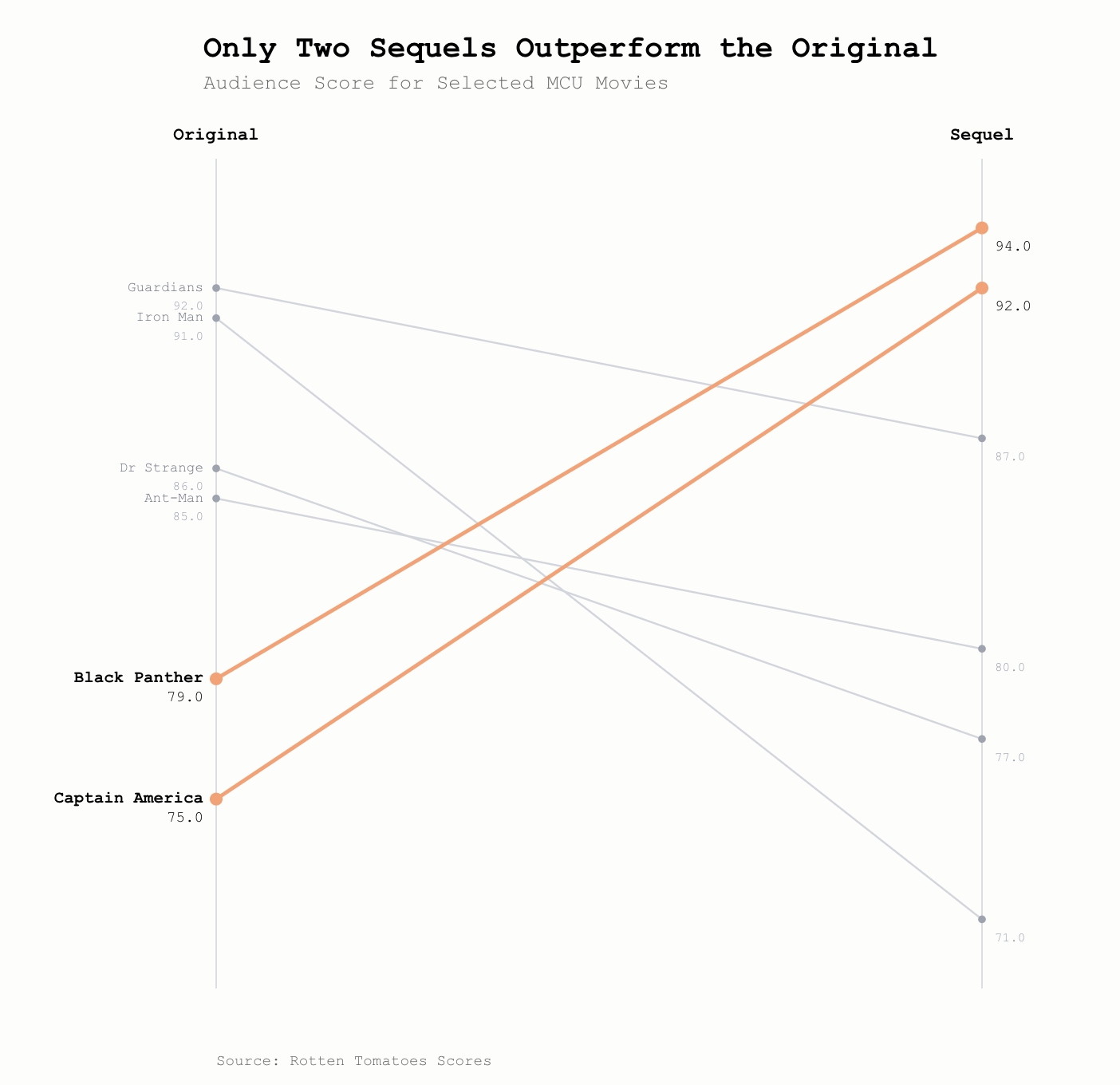
A slope chart has the opening state (or first category) on the left y axis, and the closing state (or second category) on the right y axis.
Example Story Prompts:
Which stocks have seen the biggest change in recent times?
How different are salaries between genders for different careers?
What has the swing been in voting share between elections?
What are the projections for population growth by country?
Example Chart:
Why Use Them?
We suggest you use a Slope Chart when you want to create a simple 'before-and-after' or 'compare-and-contrast' narrative that is easy to see, grasp and understand.
The contrast in flow of different lines can create a shock value or 'ah-ha' moment that your story can be crying out for.
Any Drawbacks?
They can exclude interesting transitions that take place between the two states you are evaluating.
Too many criss-crossing lines can make it hard to identify individual series.
If you're interested in percentage, rather than absolute changes, then these charts might not be quite right for you.
Top Tips and Advice for Great Design:
- Minimise the number of series you include on the chart - just focus on the key ones and the ones that create a useful comparison.
- Push your 'comparison' series to the background by making the lines grey or thin (or both!)
- Provide a contrasting colour to your lead series, bringing them to the foreground.
- If possible, add the name of each series directly onto the lines themselves to increase readability.
- Add the data values of each series directly onto both the start and end points of your series. If you have too many lines, focus on just your key data story lines.
How Can You Create One?
Slope charts are often not natively supported in tools such as Excel. You can create them, but they can be a pain.
Luckily we've built a tool to help you create your own Slope Charts. Please find it here.