Visualisation Portfolio

For us, Data Visualisation and Storytelling is a skill that you need to continually work at. It's a skill where experimentation, trial & error and critical review should be encouraged. When teaching courses on Data Visualisation, we encourage delegates to seek out bold and interesting data visualisations, and then critically assess their effectiveness through a number of different lens. The following are some example visuals and slides from our own experience where we have experimented with different approaches to tell simple but effective stories.

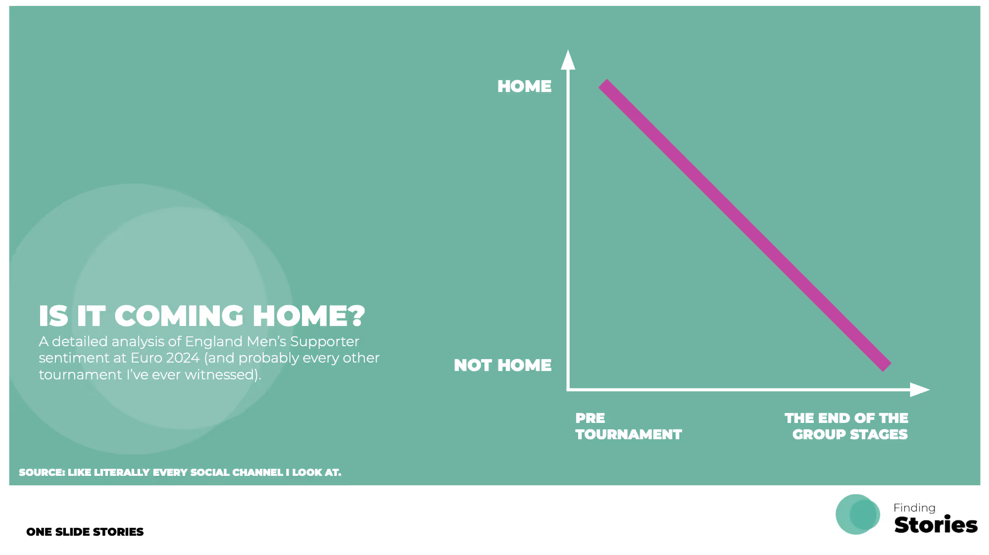
1. The concept of "Simple, One Slide Stories".

We're big fans of simple, bold visual designs to tell a data story – they’re great for grabbing attention, while still having something to say…even if it’s just light hearted. They are designed so that it should be relatively quick to process, understand and appreciate. These visualisations tend to take less time to create too. Win, win. Here’s a few personal examples:
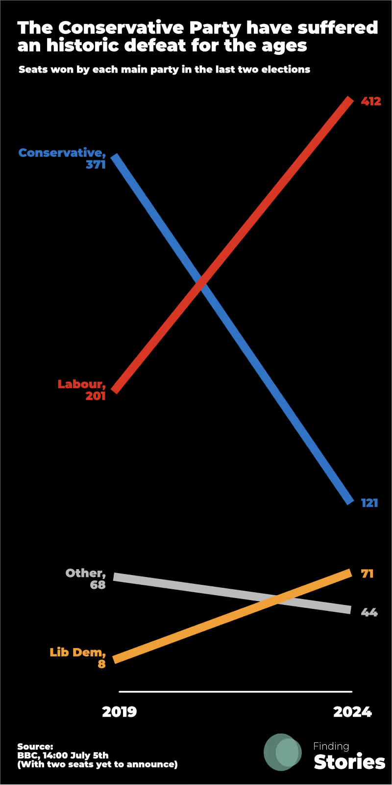
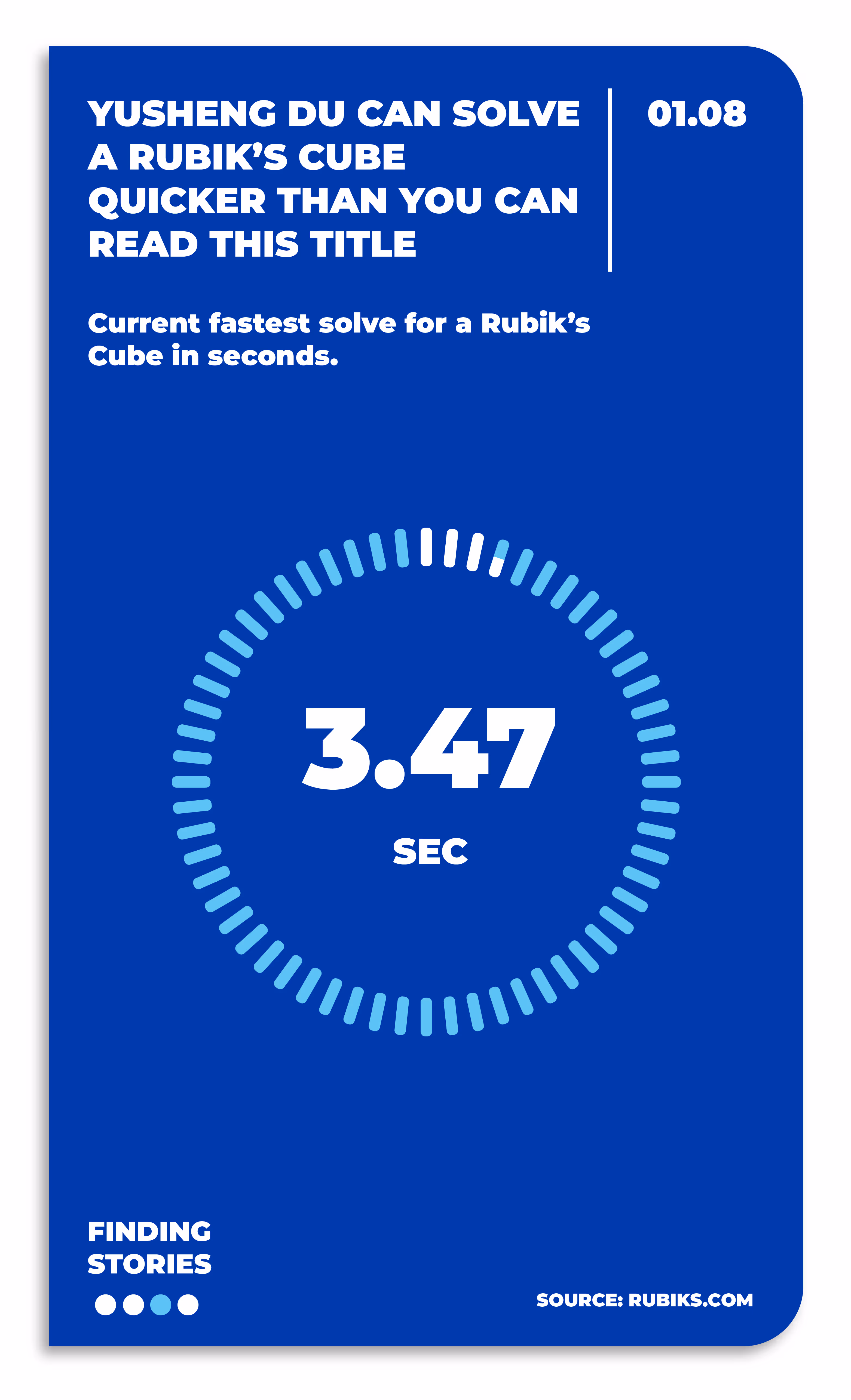
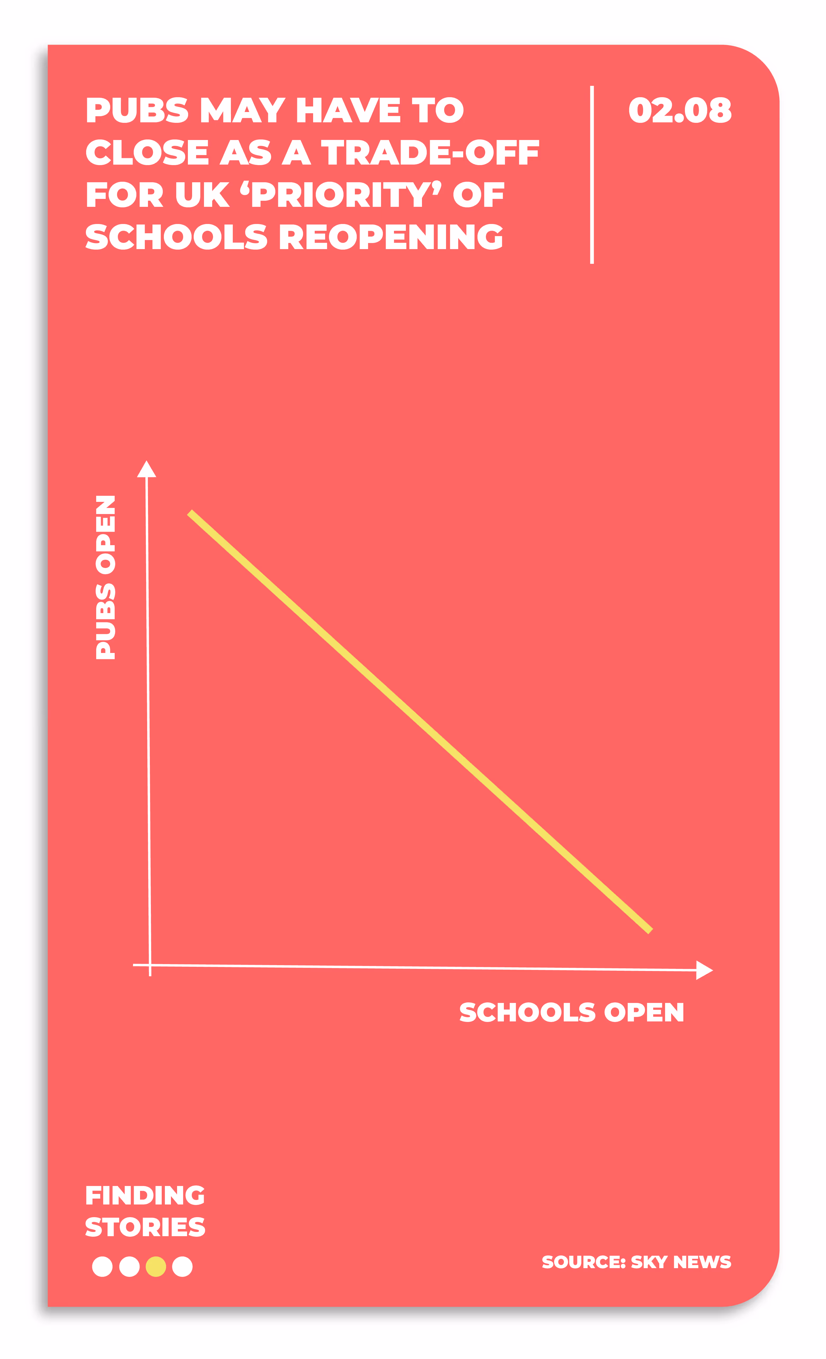
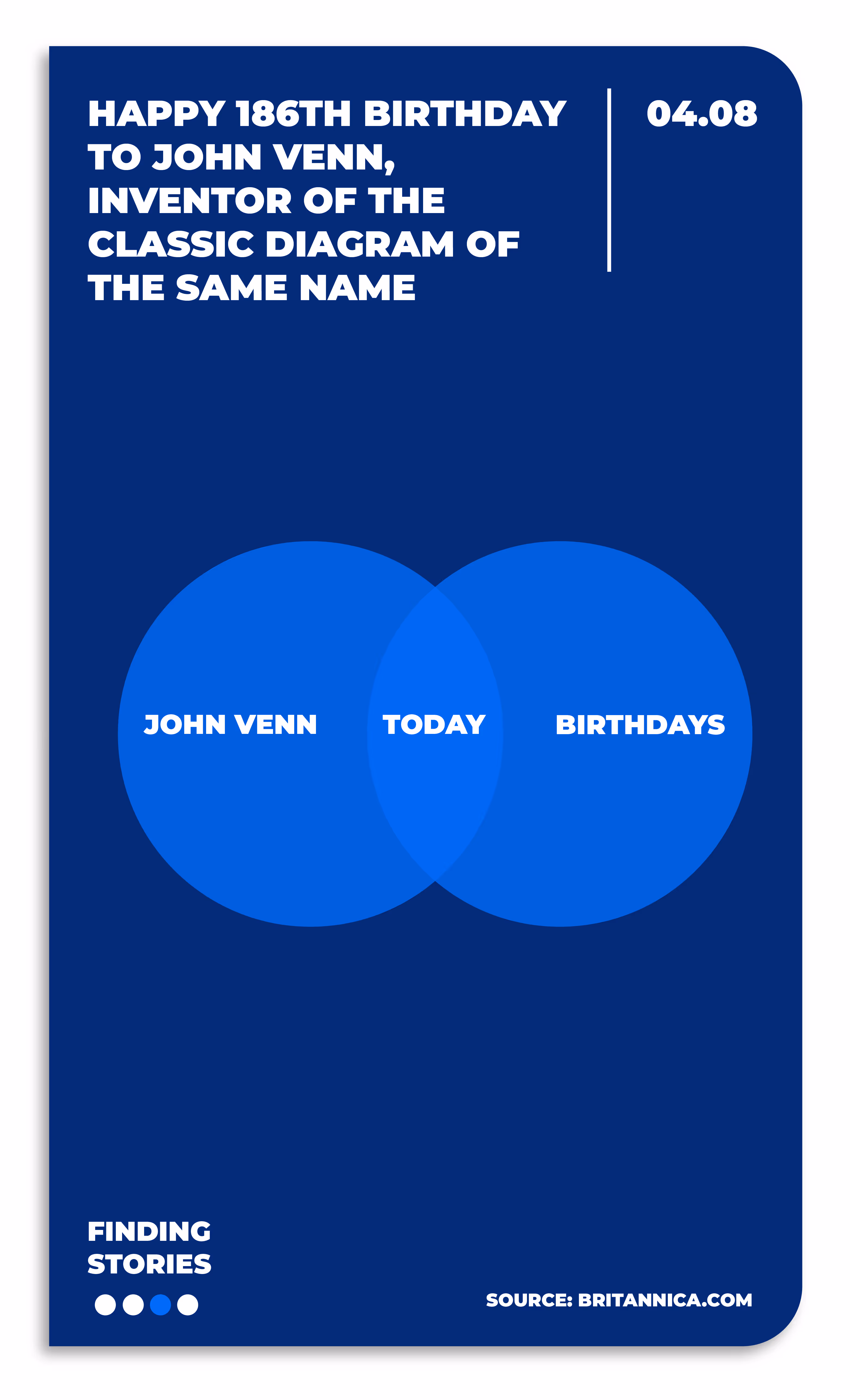
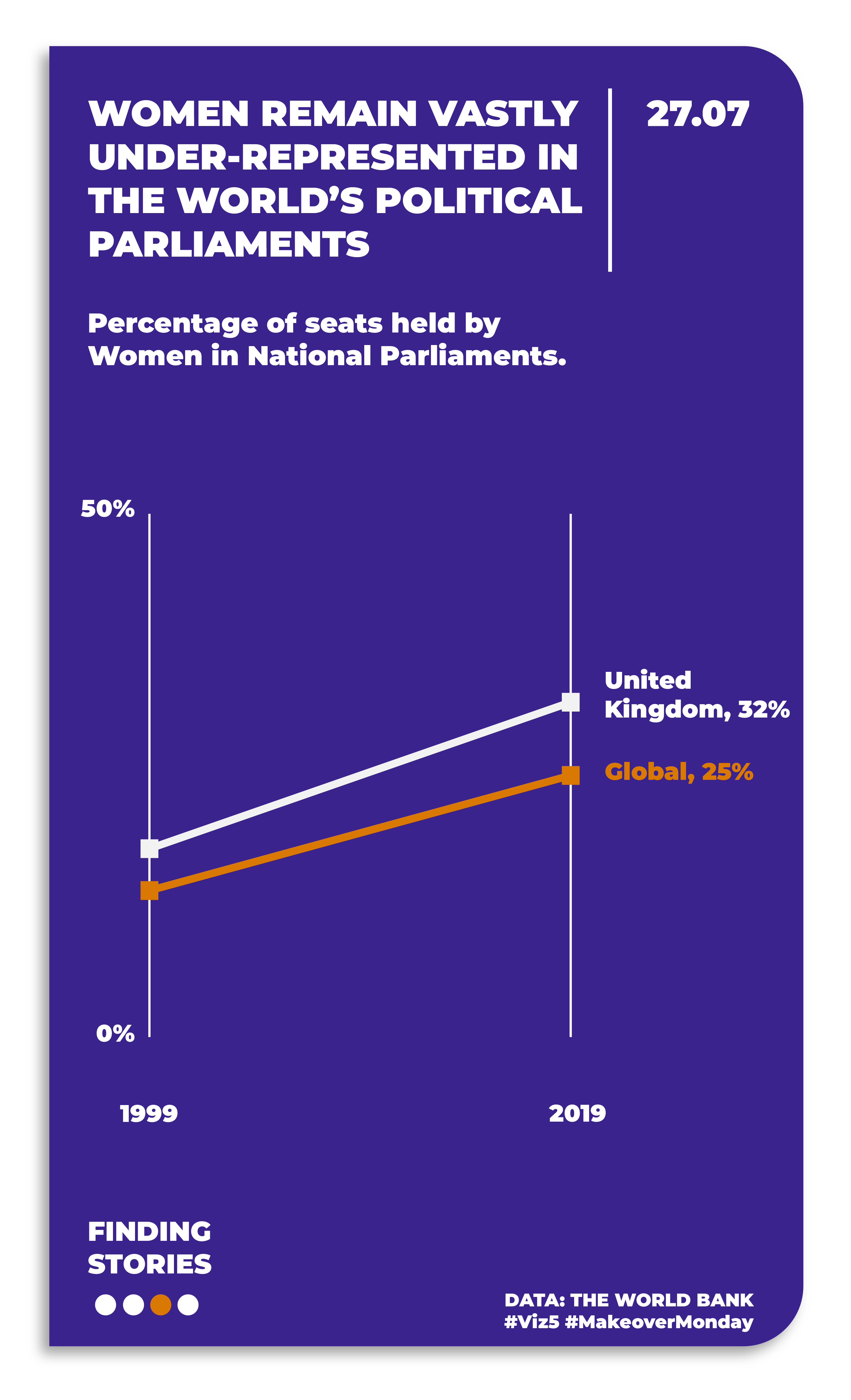
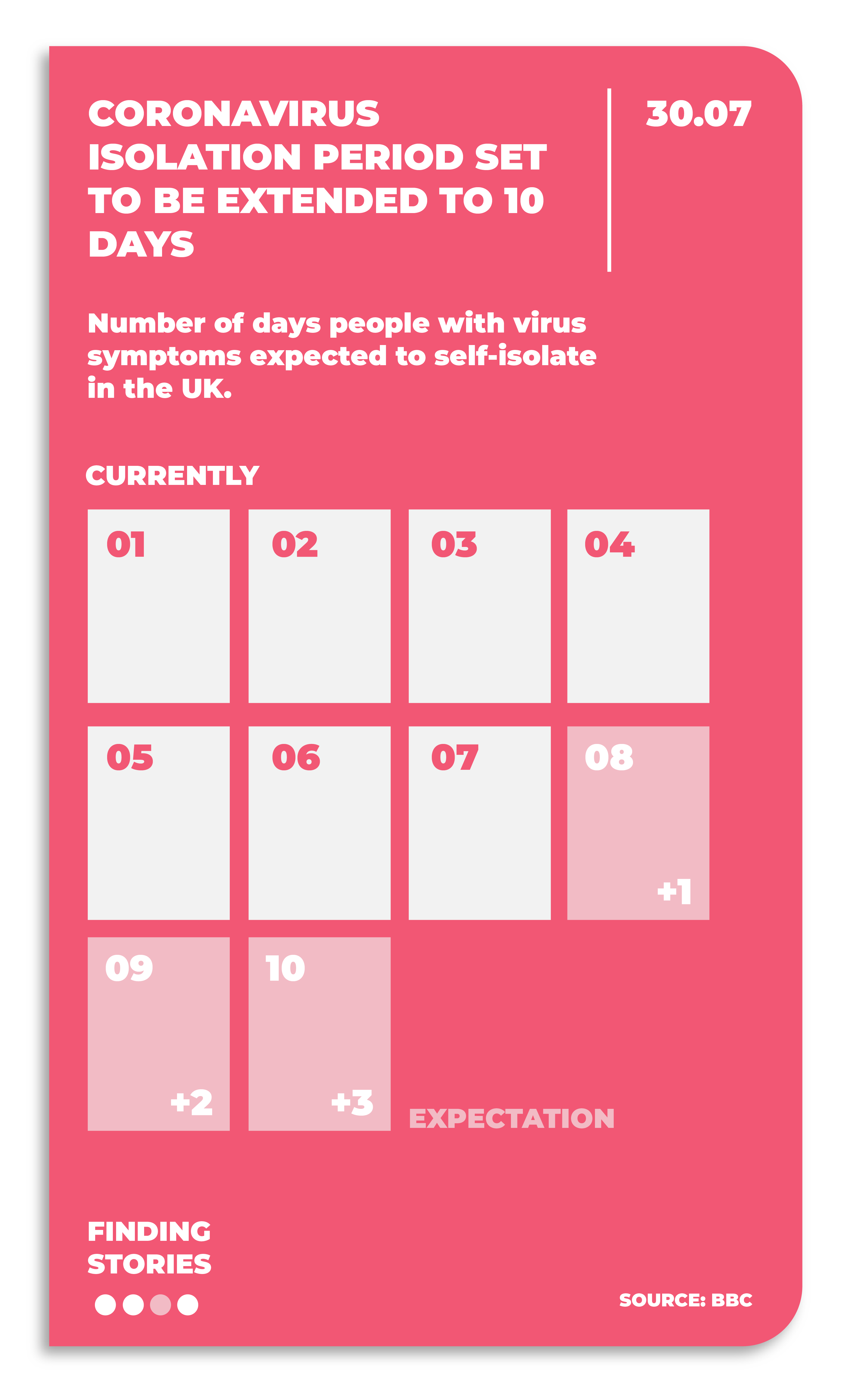
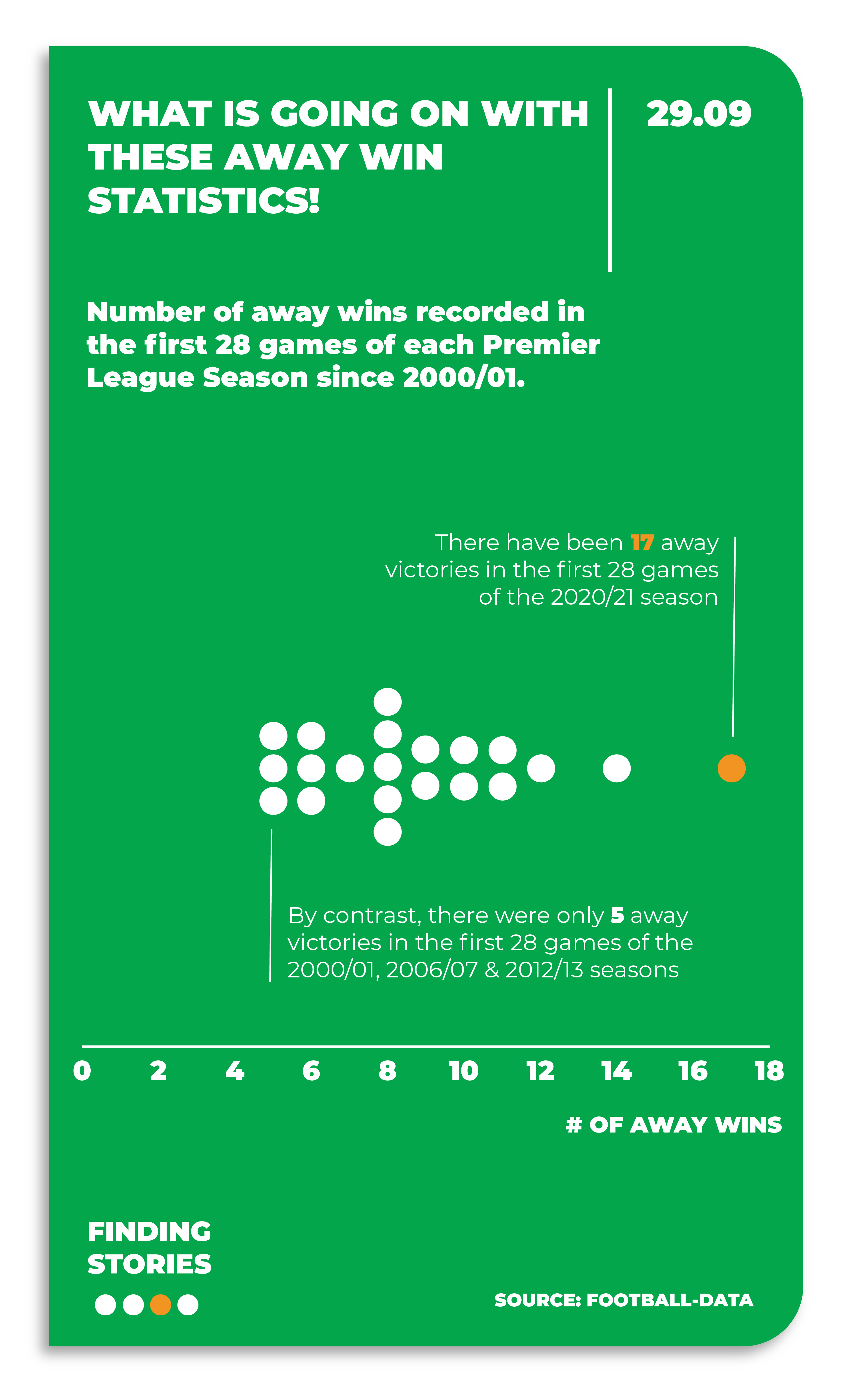
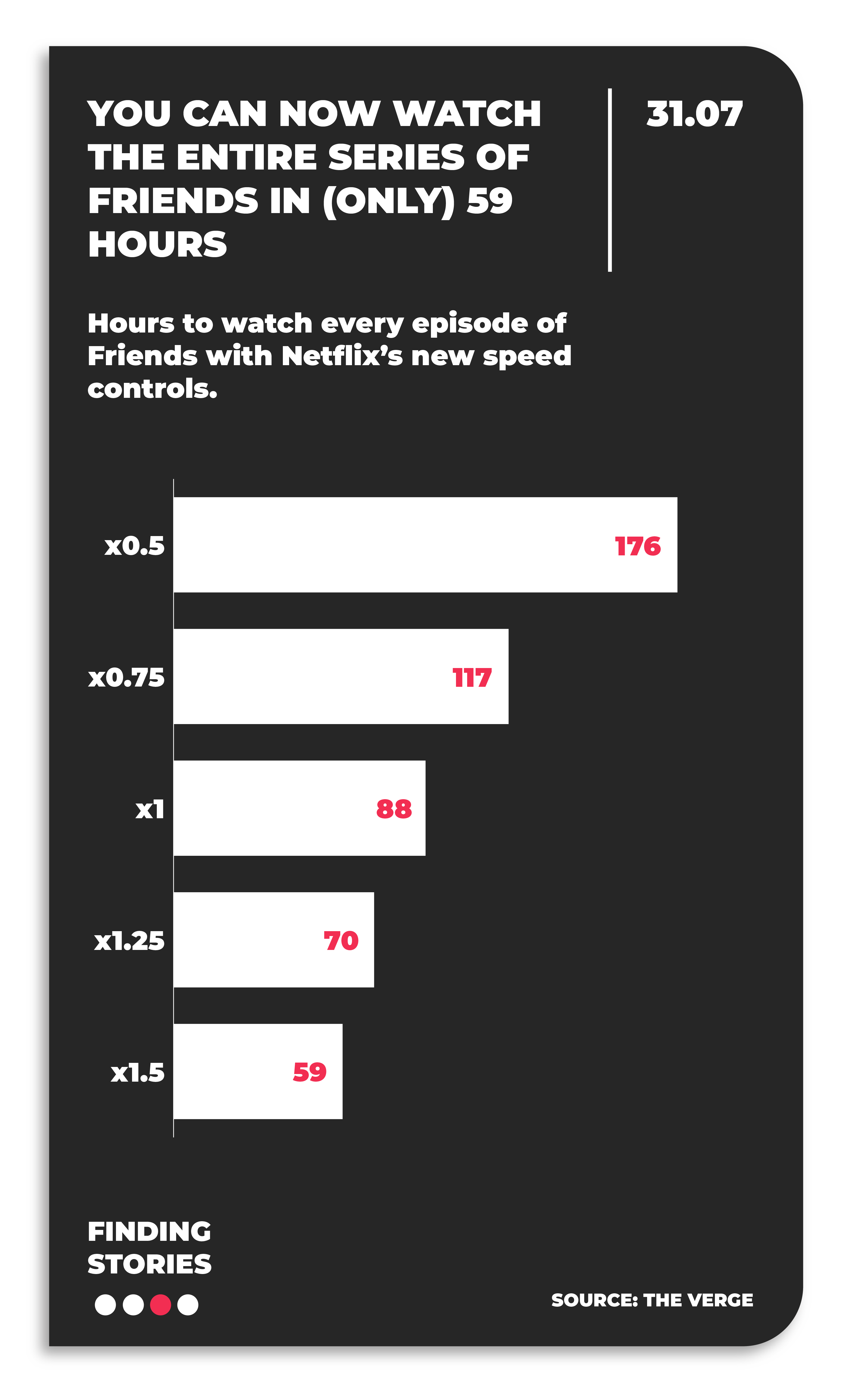
Line chart showing England men's supporter sentiment dropping from 'Home' before the tournament to 'Not Home' by the end of the group stages at Euro 2024.Line chart showing seats won by main parties in UK elections from 2019 to 2024, with Conservatives dropping from 371 to 121 seats and Labour rising from 201 to 412 seats.

2. Today's Story

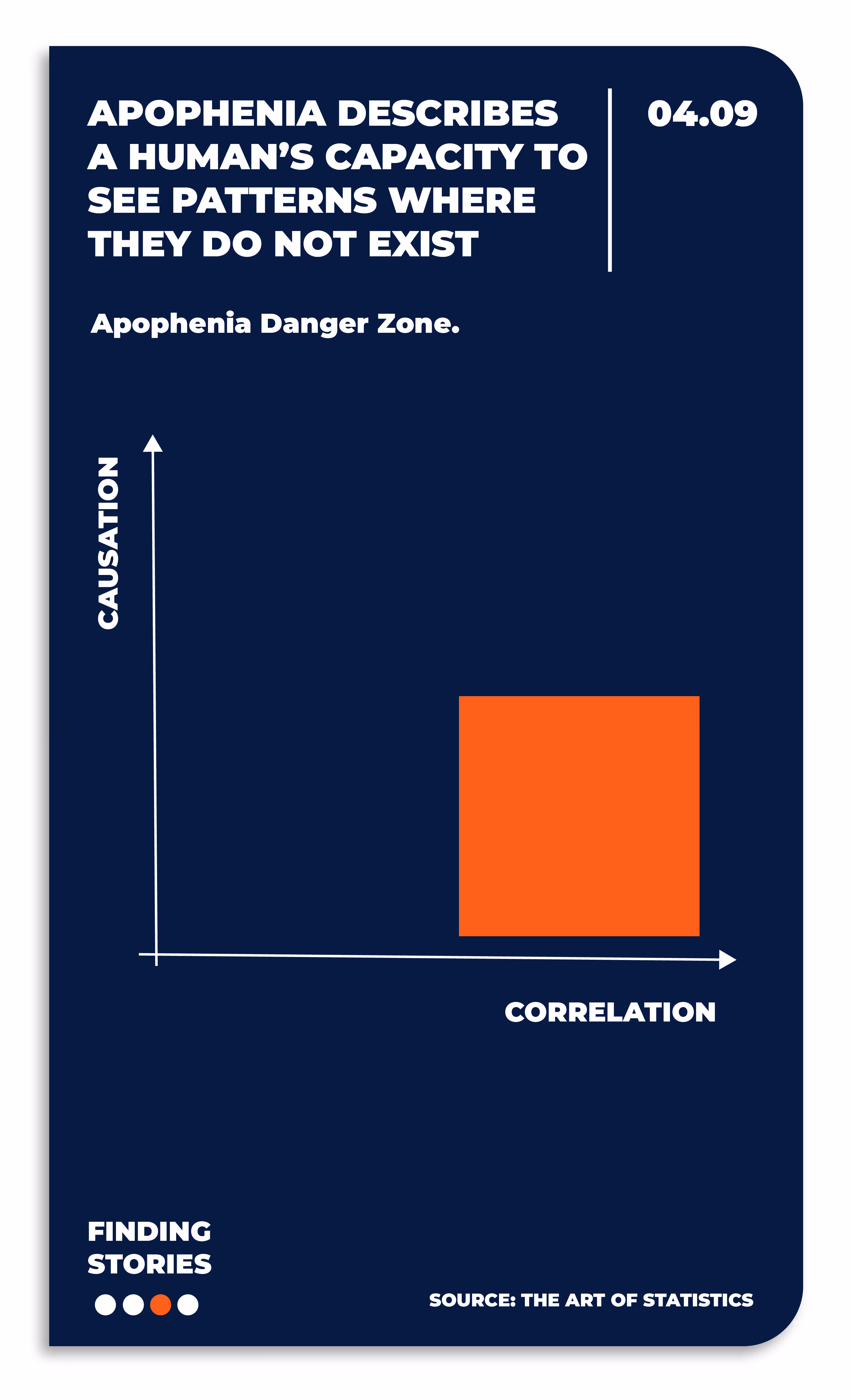
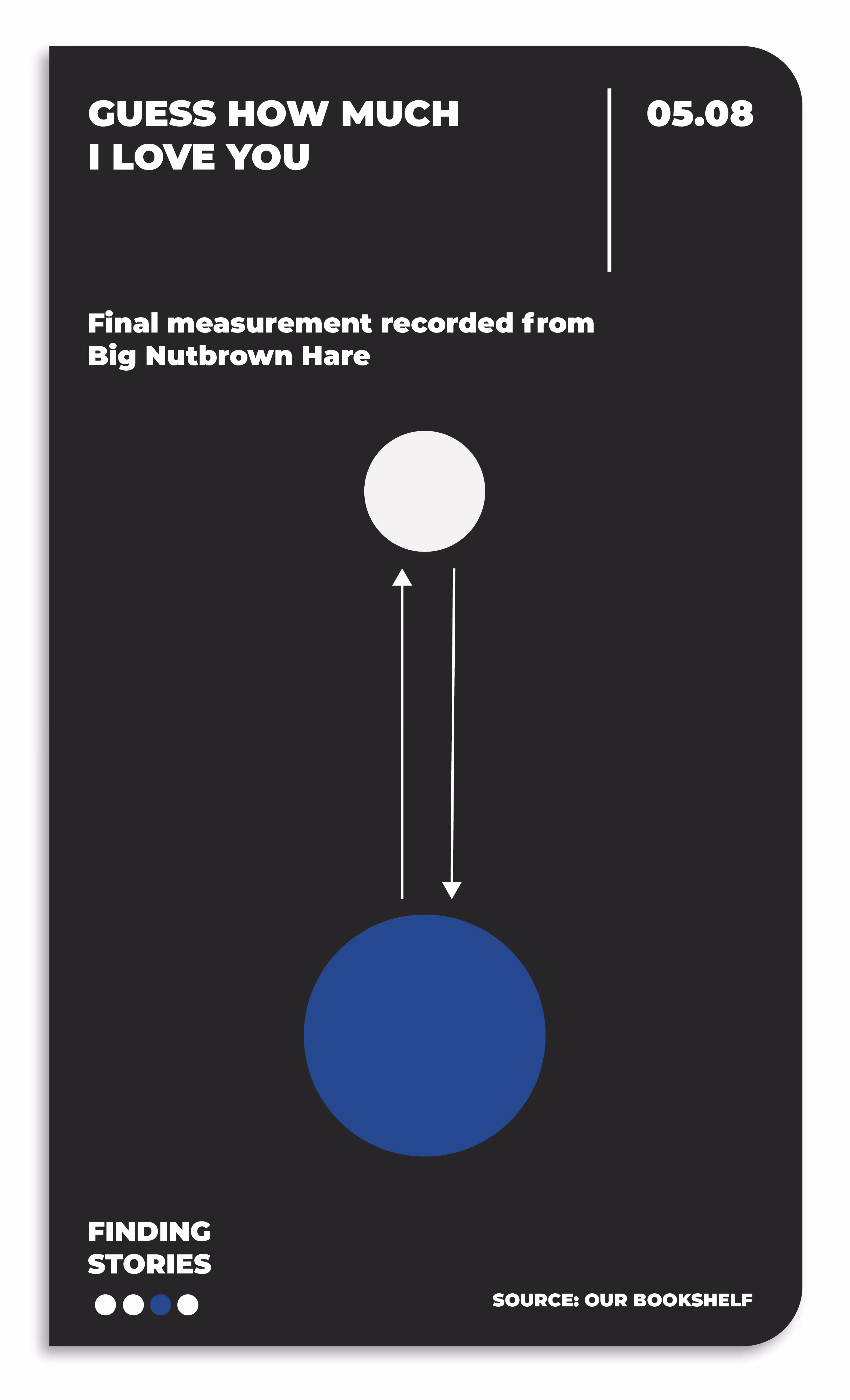
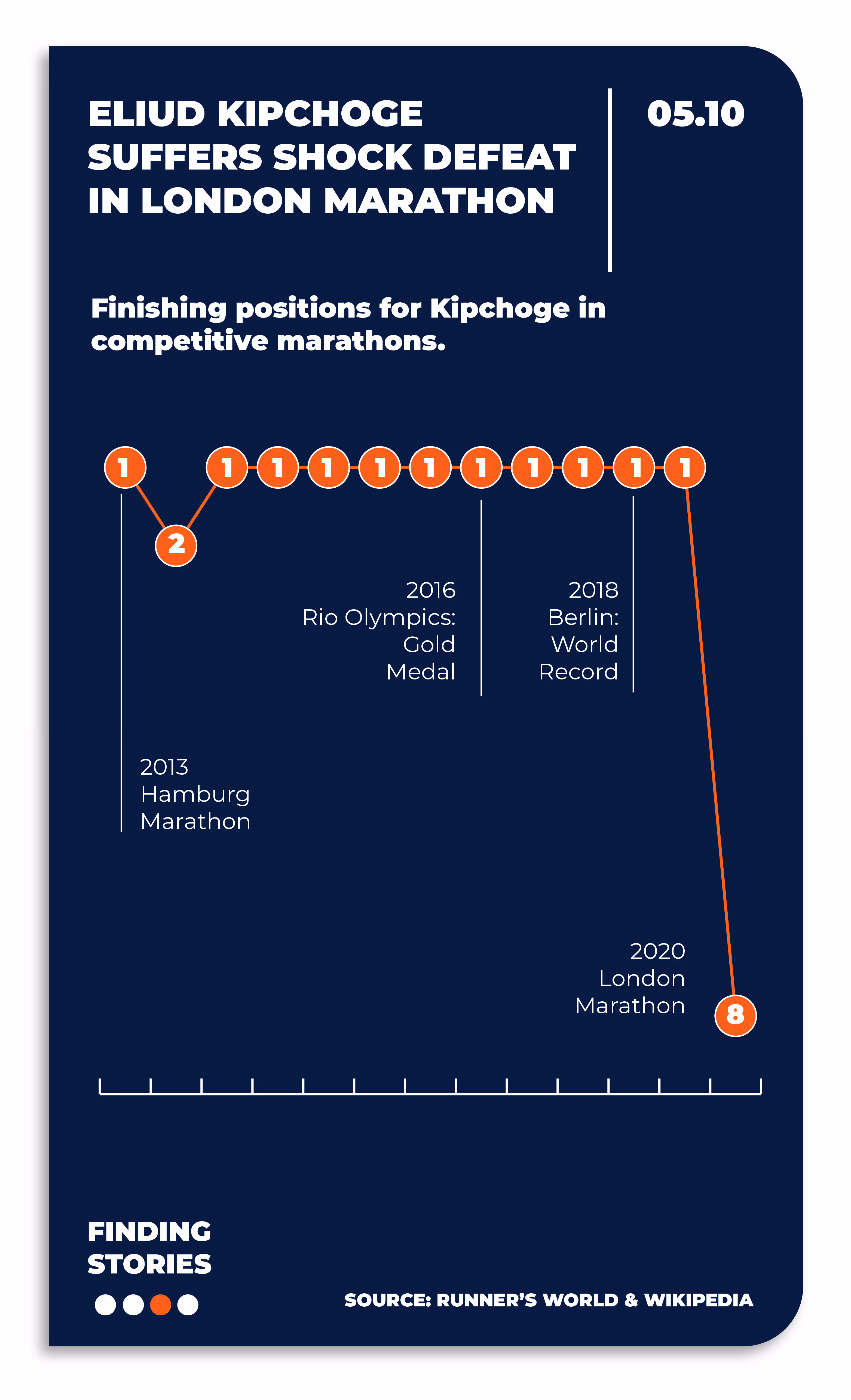
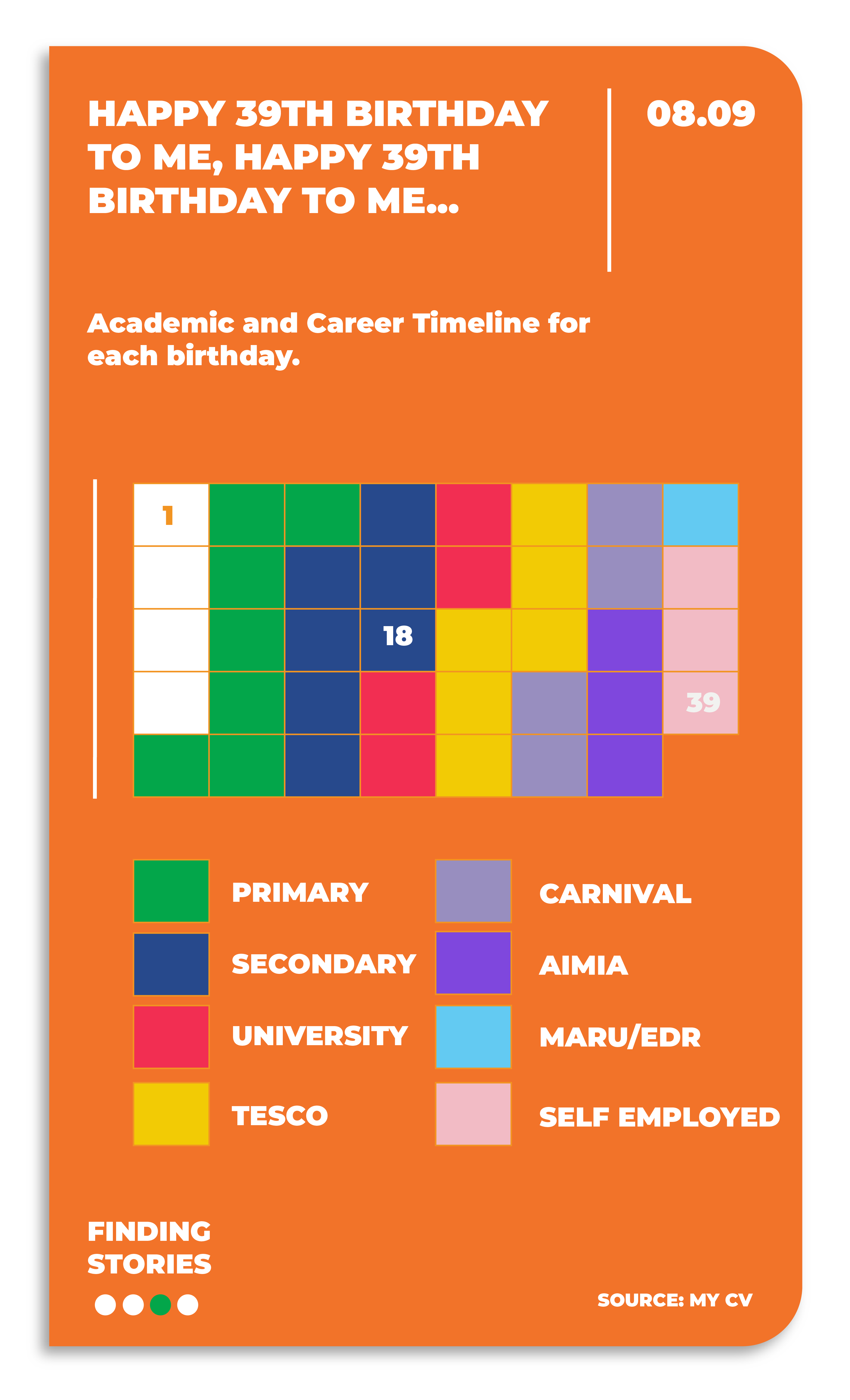
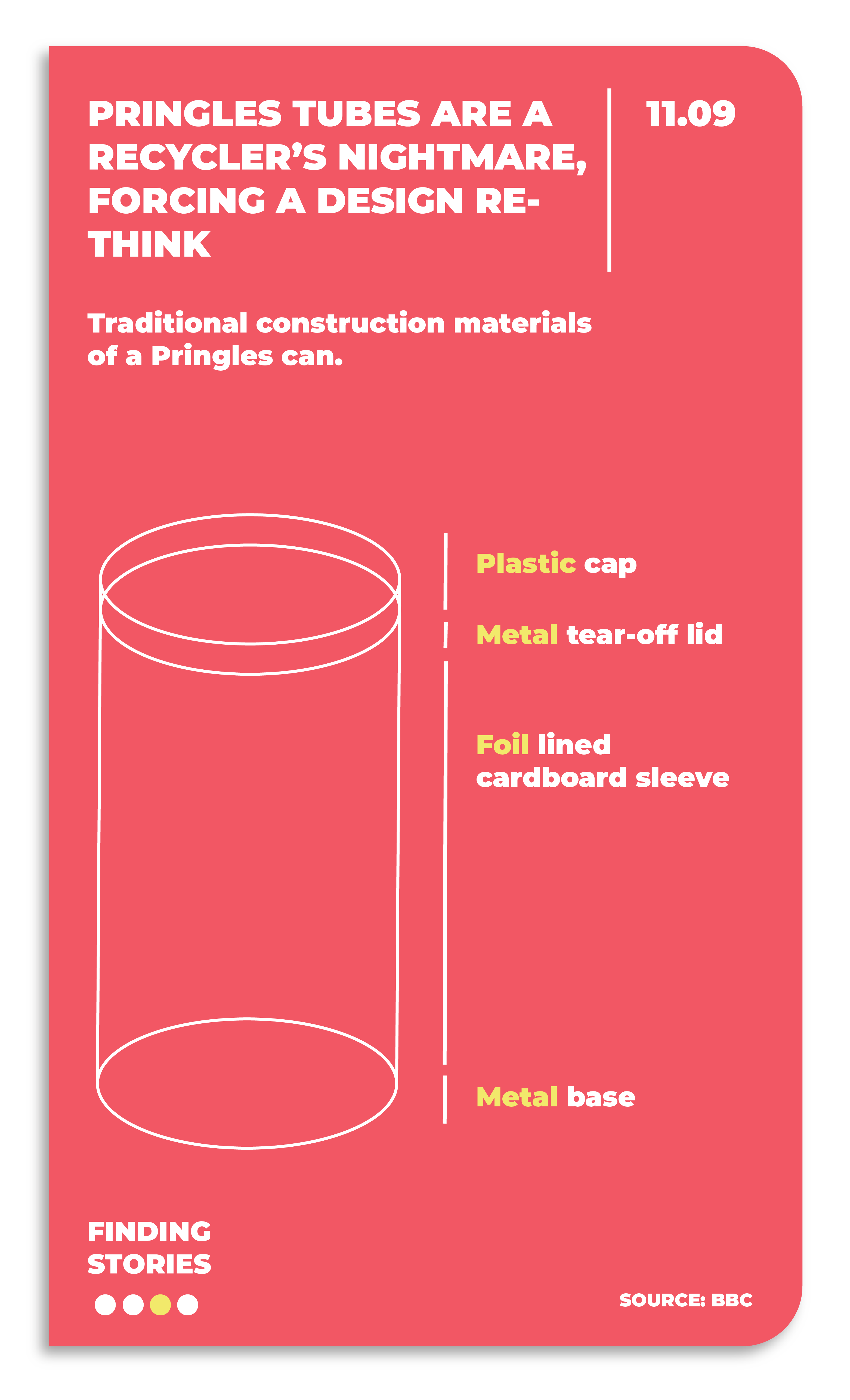
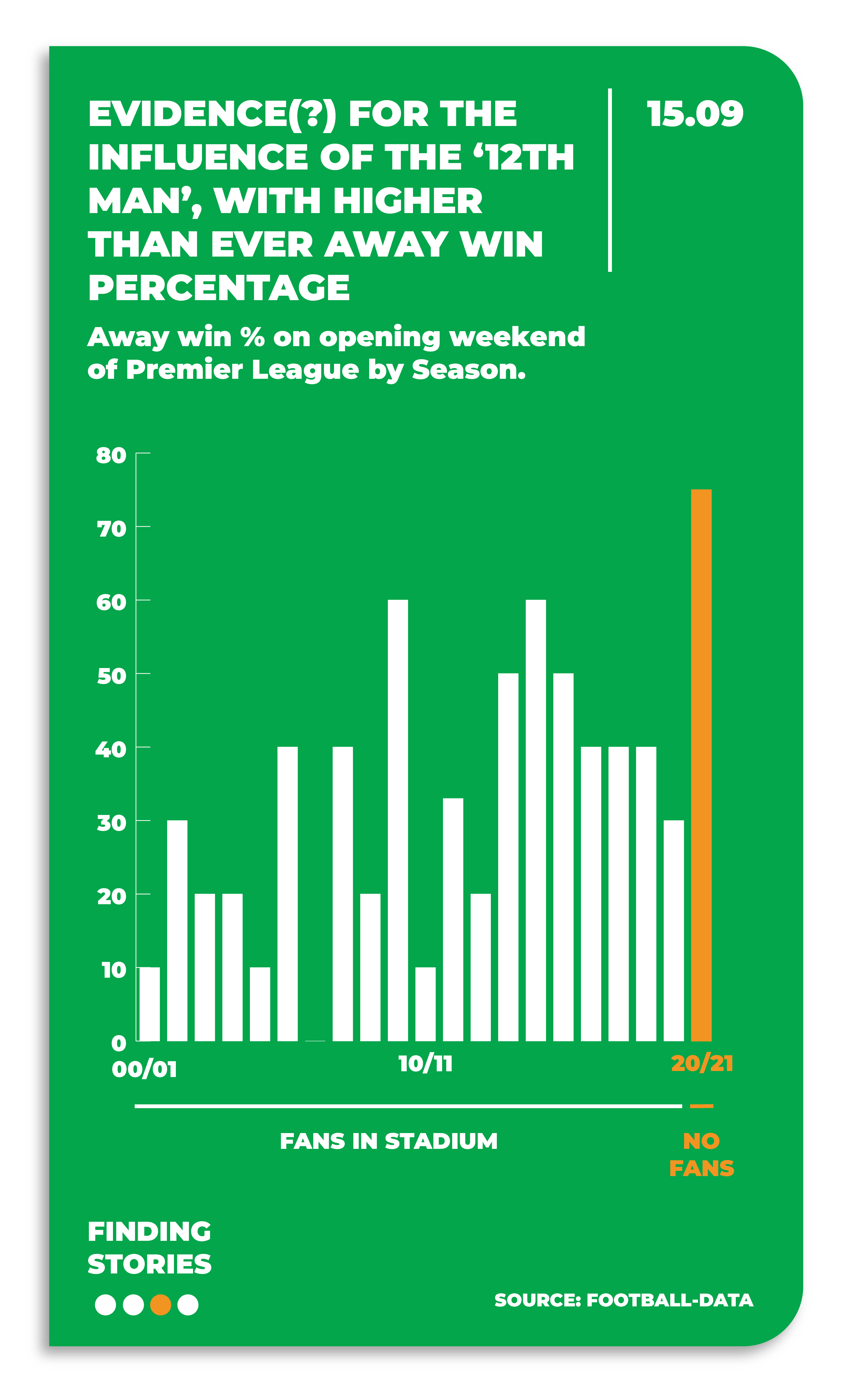
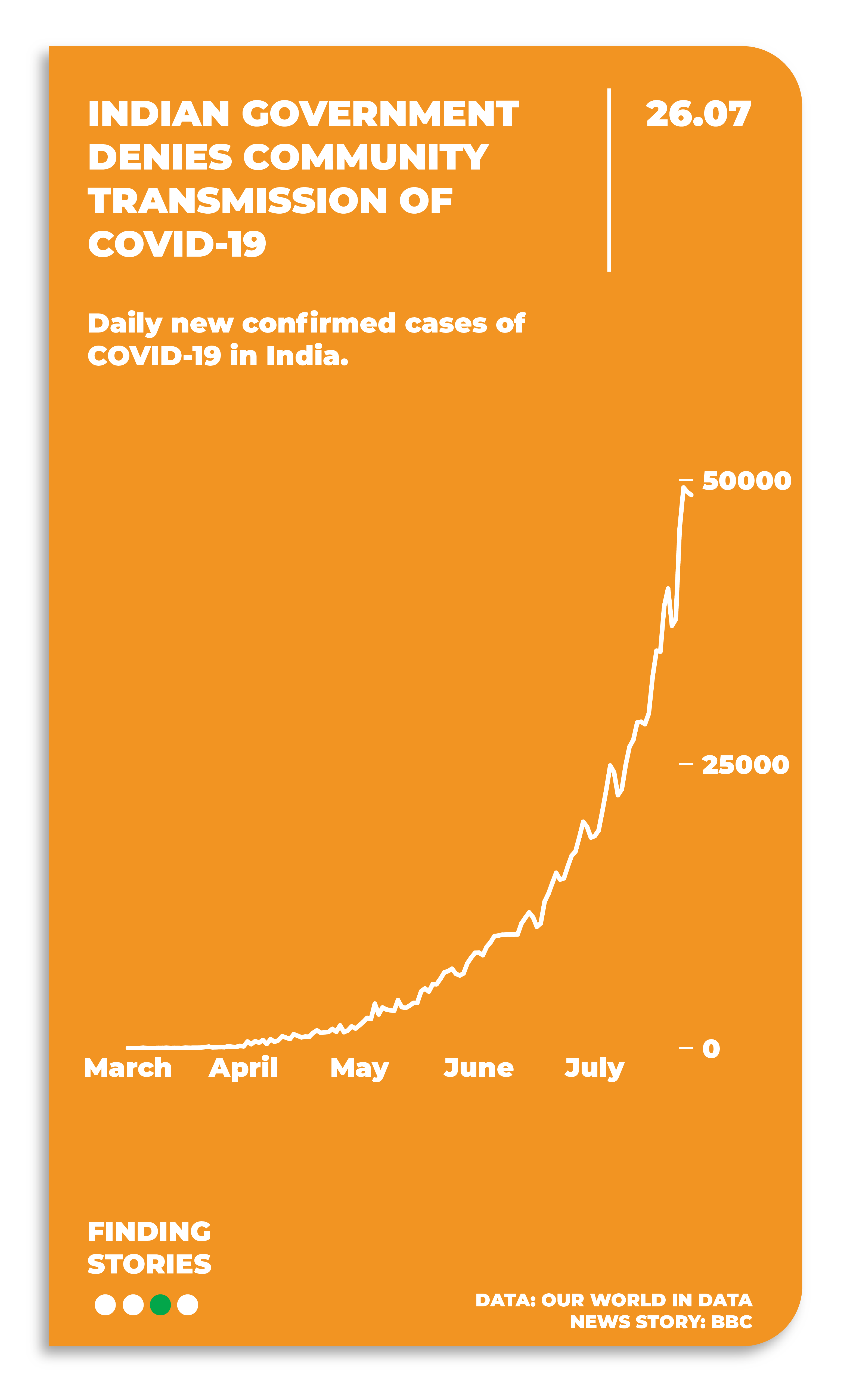
Back in 2020, I gave myself the challenge of creating some simple Daily Stories. My brief was to find a story in the news / something I’d recently seen and create a simple chart of it to bring the story to life through visualisation. Here are some examples:
(Note. these visuals were created during Covid Lockdown, so quite a few references to that and the stories around it).

Graphic showing Yusheng Du's current fastest Rubik's Cube solve time of 3.47 seconds with a circular progress bar on a blue background.Graph showing a negative correlation between pubs open and schools open, highlighting a trade-off for UK priority on school reopening.Graphic with blue Venn diagram showing 'John Venn' and 'Birthdays' circles overlapping at 'Today', celebrating John Venn's 186th birthday on 04.08.Infographic explaining apophenia as the tendency to see patterns where none exist, highlighting a danger zone with high correlation but low causation.Graphic showing two circles with arrows between them representing the final measurement recorded from Big Nutbrown Hare, titled 'Guess How Much I Love You' dated 05.08.Chart showing Eliud Kipchoge's finishing positions in competitive marathons from 2013 to 2020 with mostly first places, a second place in 2013 Hamburg Marathon, gold medal in 2016 Rio Olympics, world record in 2018 Berlin, and eighth place in 2020 London Marathon.Academic and career timeline chart showing progression from primary school to self-employed across ages 1, 18, and 39, with color-coded blocks for Primary, Secondary, University, Tesco, Carnival, Aimia, Maru/EDR, and Self Employed.Infographic showing traditional construction materials of a Pringles can: plastic cap, metal tear-off lid, foil lined cardboard sleeve, and metal base on a red background.Bar graph showing away win percentage on Premier League opening weekends by season from 00/01 to 20/21, highlighting a peak of 75% in 20/21 season with no fans in stadium.Graph comparing expected versus actual applications for receptionist job in Manchester, showing actual applications far exceeding expectations.Line graph showing daily new confirmed COVID-19 cases in India rising sharply from March to July, reaching nearly 50,000 by July 26.Line graph showing percentage of parliamentary seats held by women increasing from 1999 to 2019, with the United Kingdom at 32% and the global average at 25% in 2019.Infographic showing UK coronavirus isolation period extended from 7 to 10 days, with days 8, 9, and 10 highlighted as additional expected isolation days.Dot chart showing number of away wins in first 28 Premier League games each season since 2000/01, highlighting 17 wins in 2020/21 and only 5 wins in 2000/01, 2006/07, and 2012/13 seasons.Bar chart showing hours to watch every episode of Friends at different Netflix speed controls: 176 hours at 0.5x, 117 hours at 0.75x, 88 hours at 1x, 70 hours at 1.25x, and 59 hours at 1.5x speed.

3. Business Stories

For most of us, the visualisation stories we create will be used in the business context: How are sales trending up or down? Who are our customers? When is the right time to launch a new line? Etc.

My aim when creating data visualisations in my business work has always been to tell a story, make it easy to understand and make it pleasurable – three key facets of what I believe make up the ‘Anatomy of a Good Chart’:

A chart titled 'The Anatomy of a Good Chart' showing a purple triangular radar diagram with three labels: 1 Pleasurable, 2 Easy to Understand, 3 Tells a Story; descriptive text defines each label emphasizing satisfaction, clarity, and storytelling.
Taken from our "Design Better Charts" Course.

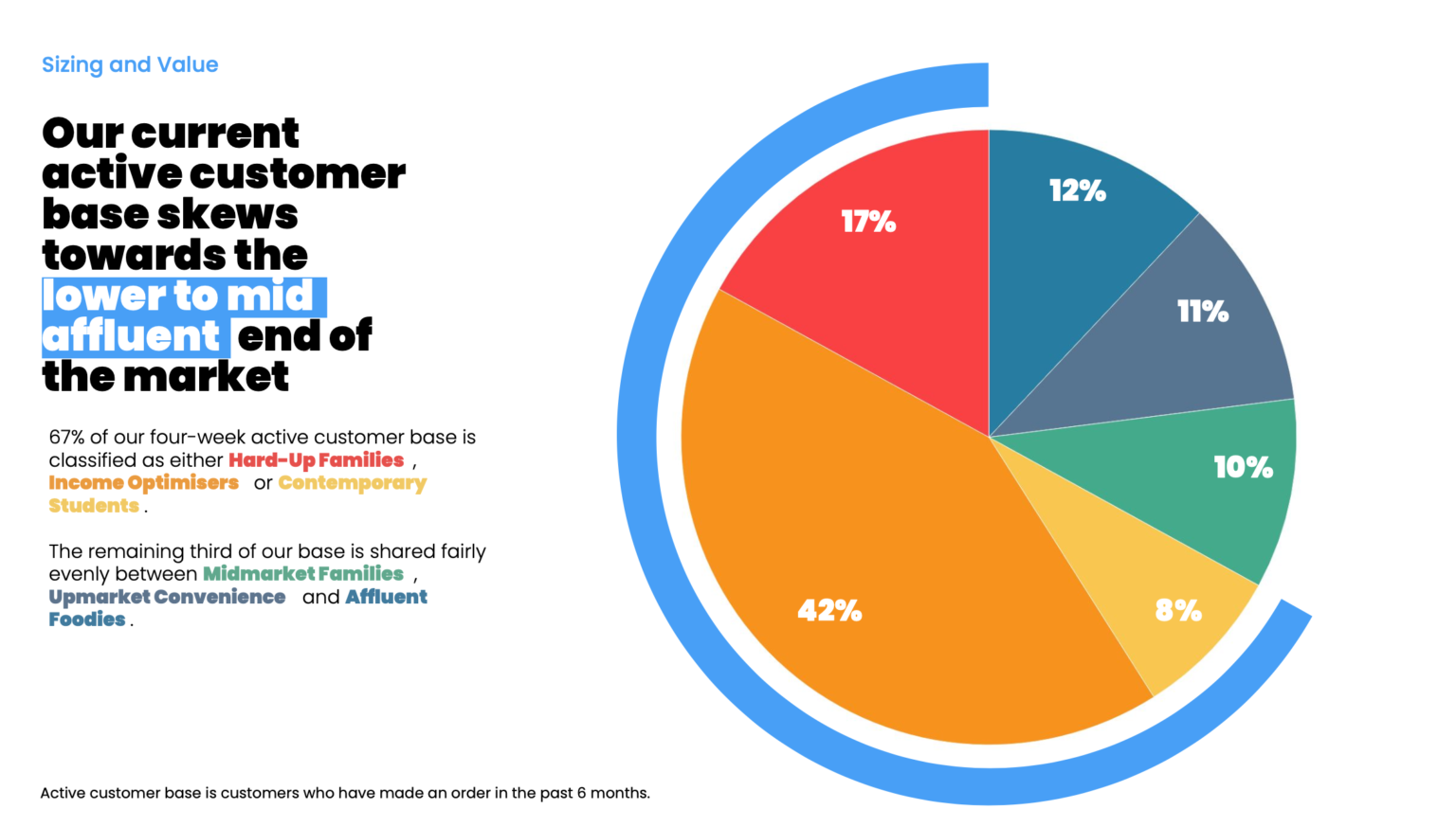
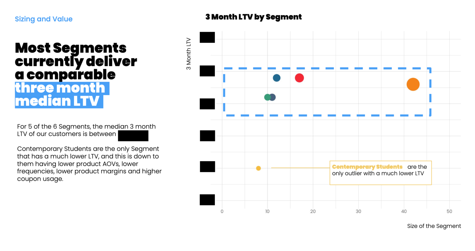
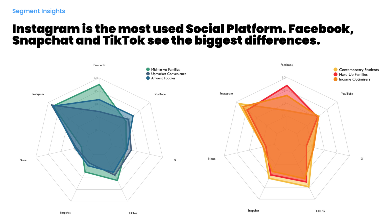
The following are some example 'Business Stories' with the above Good Chart guide in mind for a Consumer Segmentation Overview:

Pie chart showing customer base distribution: 42% Income Optimisers, 17% Hard-Up Families, 12% Upmarket Convenience, 11% Midmarket Families, 10% Affluent Foodies, 8% Contemporary Students.
Segmentation Distribution Chart. Note the use of colours in the text and chart to help link together the narrative with the visualisation.
Scatter plot showing 3 month lifetime value (LTV) by segment, with most segments clustered in a blue dashed box indicating comparable median LTV, and one outlier segment labeled 'Contemporary Students' with much lower LTV and smaller size.
Note the usage of a call out box to help the user understand the visual and a key story it contains. (Values redacted for confidentiality).
Two radar charts comparing social media use across segments: left chart shows Midmarket Families, Upmarket Convenience, Affluent Foodies with Instagram as the highest platform; right chart shows Contemporary Students, Hard-Up Families, Income Optimisers with Instagram also leading but varied Facebook and TikTok usage.
Radar visualisations as a (sometimes) effective change to a standard grouped bar chart. Sometimes a different visualisation can 'force' your audience to work a bit harder for the insight and in turn achieve more understanding at the same time.