Resources | Chart Selectors
When sharing your story, its important you choose the right visualisation for your data. There are right and wrong choices you can make, and there are often more interesting choices you can make as well. Below you can find a selection of online tools to help you choose the right viz for your data.
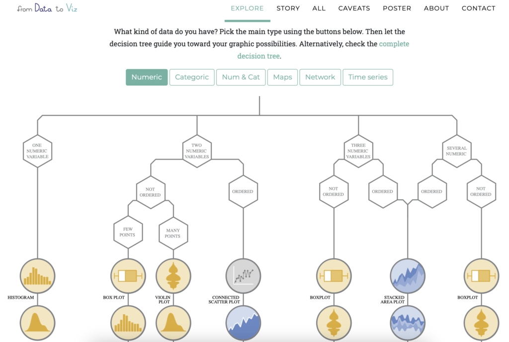
1. From Data to Viz
From Data to Viz leads you to the most appropriate graph for your data.
Its a great resource to help you decide what might be the most appropriate visualisation based on your data.
www.data-to-viz.com
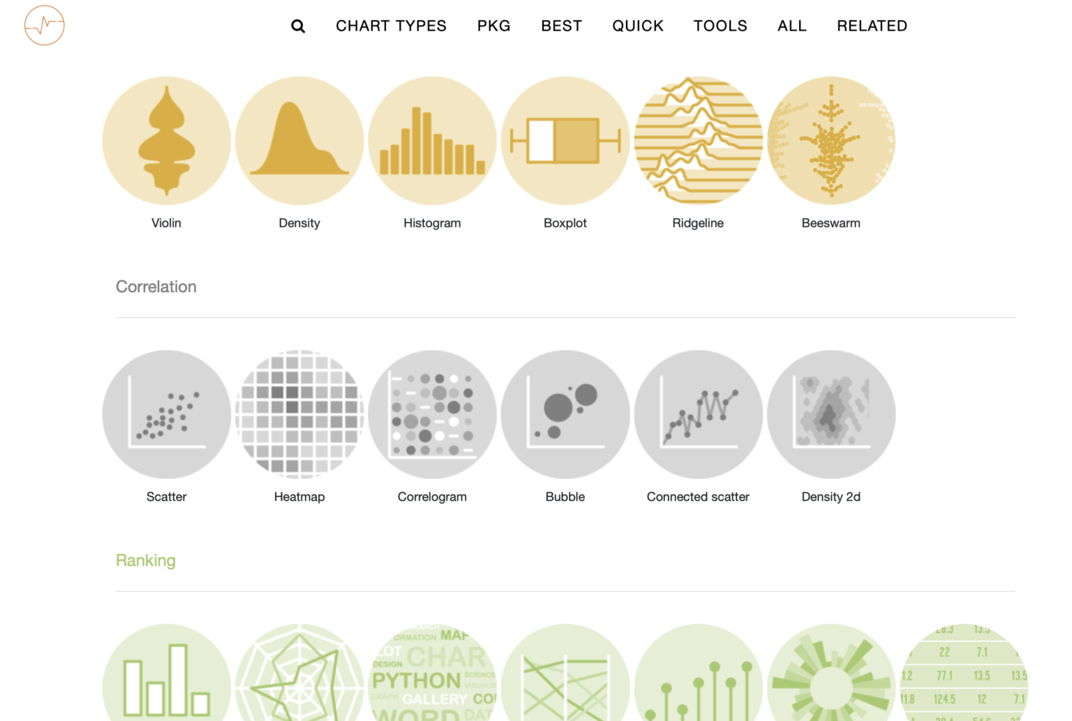
2. Graph Gallery
A collection of charts made with the R, Python and D3 programming languages.
A great resource for some data visualisation inspiration, as well as reproducible code so you can create your own in your language of choice.
www.r-graph-gallery.com
www.python-graph-gallery.com
www.d3-graph-gallery.com